Role: Concept Developer, Sr. AD
Medium: Branding, Website UI/UX Design
In 2016, while serving as Sr. Art Director for Matchbox Design Group, I pushed both for a whole-agency rebrand, as well as a new website that showed the both the creative process, as well as an enhanced, more detailed content focused on showcasing the agencies work.
For the branding and mark, a simple, bold typeface was chosen, with a tiny notch on the "X" meant to act as a stylized flame, and utilizing the color pink as one that could be "owned" in the St. Louis market, as there were no other agencies in town at that time utilizing that color as their primary palette.
And, as this was an internal document, the standard "Lorem Ipsum" was replaced with the infinitely more fun "Delorean Ipsum," in which lines from the film "Back to the Future" were randomly generated to fill out the spaces where copy was needed.
Medium: Branding, Website UI/UX Design
In 2016, while serving as Sr. Art Director for Matchbox Design Group, I pushed both for a whole-agency rebrand, as well as a new website that showed the both the creative process, as well as an enhanced, more detailed content focused on showcasing the agencies work.
For the branding and mark, a simple, bold typeface was chosen, with a tiny notch on the "X" meant to act as a stylized flame, and utilizing the color pink as one that could be "owned" in the St. Louis market, as there were no other agencies in town at that time utilizing that color as their primary palette.
And, as this was an internal document, the standard "Lorem Ipsum" was replaced with the infinitely more fun "Delorean Ipsum," in which lines from the film "Back to the Future" were randomly generated to fill out the spaces where copy was needed.
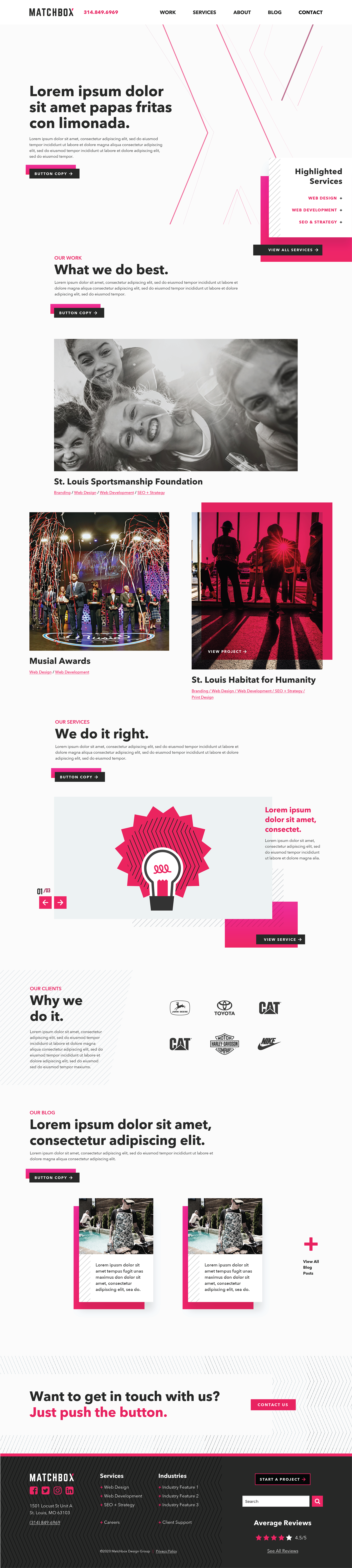
Agency Website Home Page
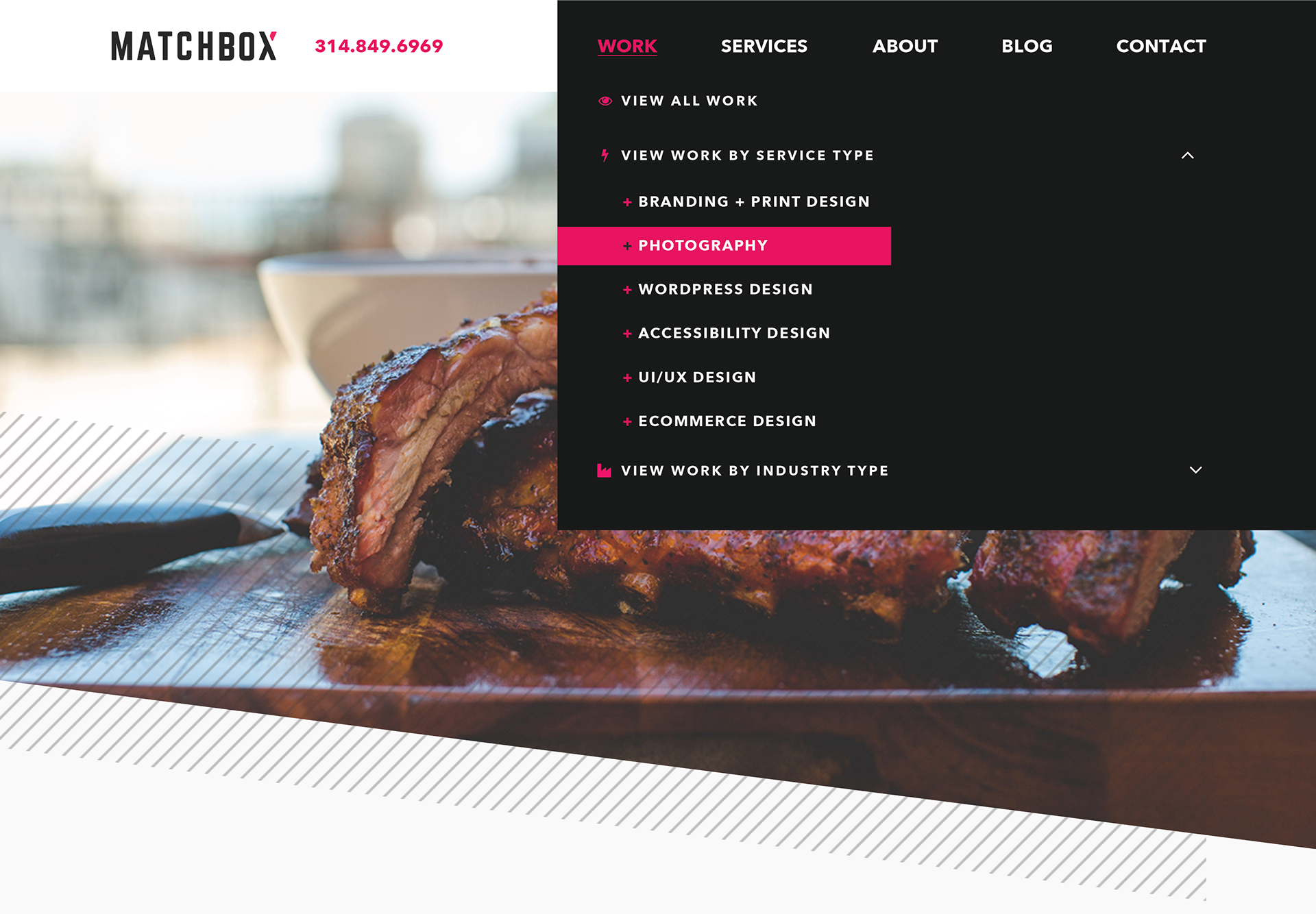
Navigation Dropdown Menu
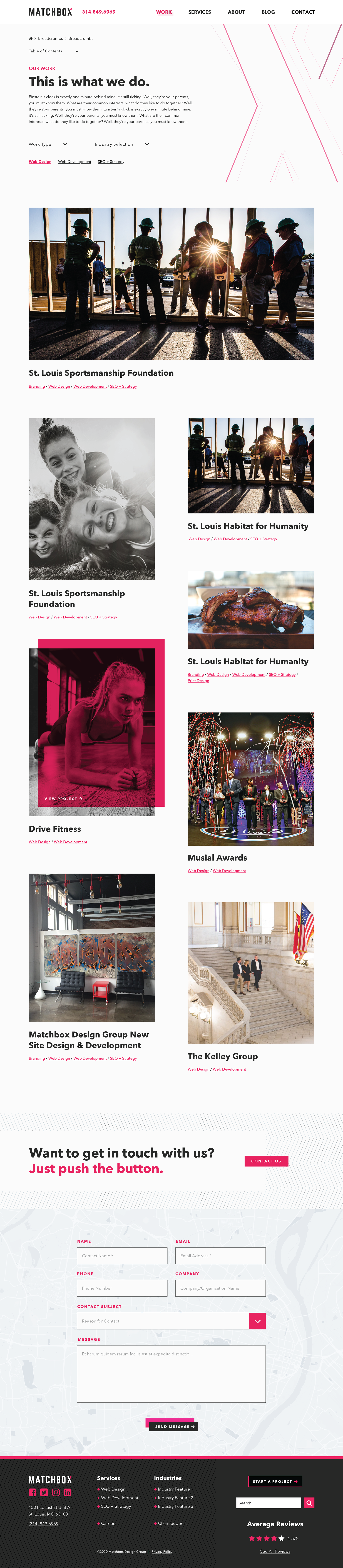
Agency Work Landing Page

Project-Specific Page Template

Team Landing Page
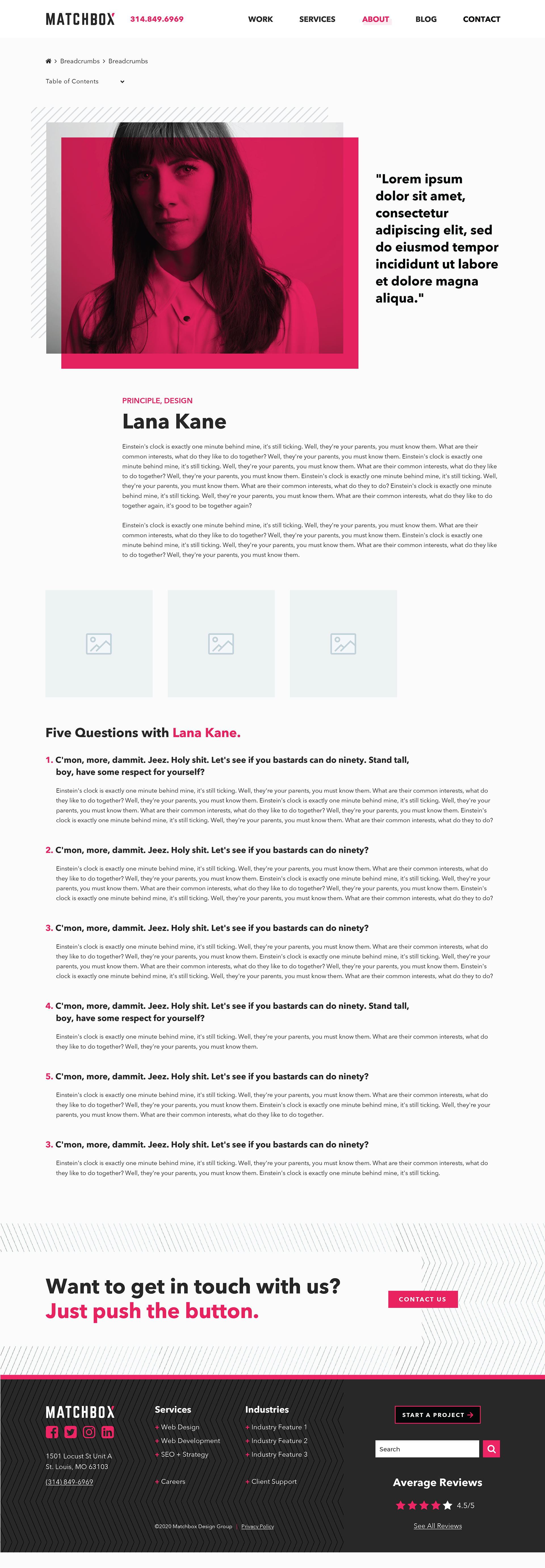
Team Member Individual Page
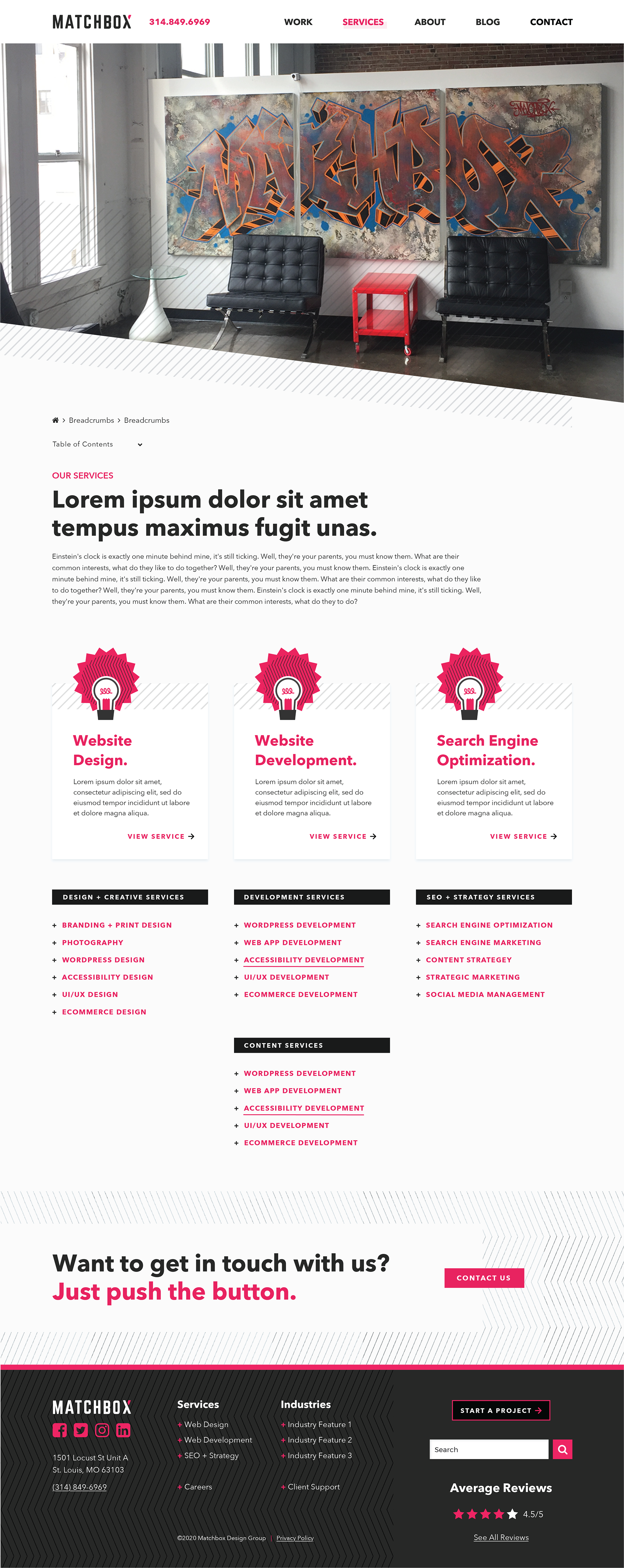
Agency Services Landing Page
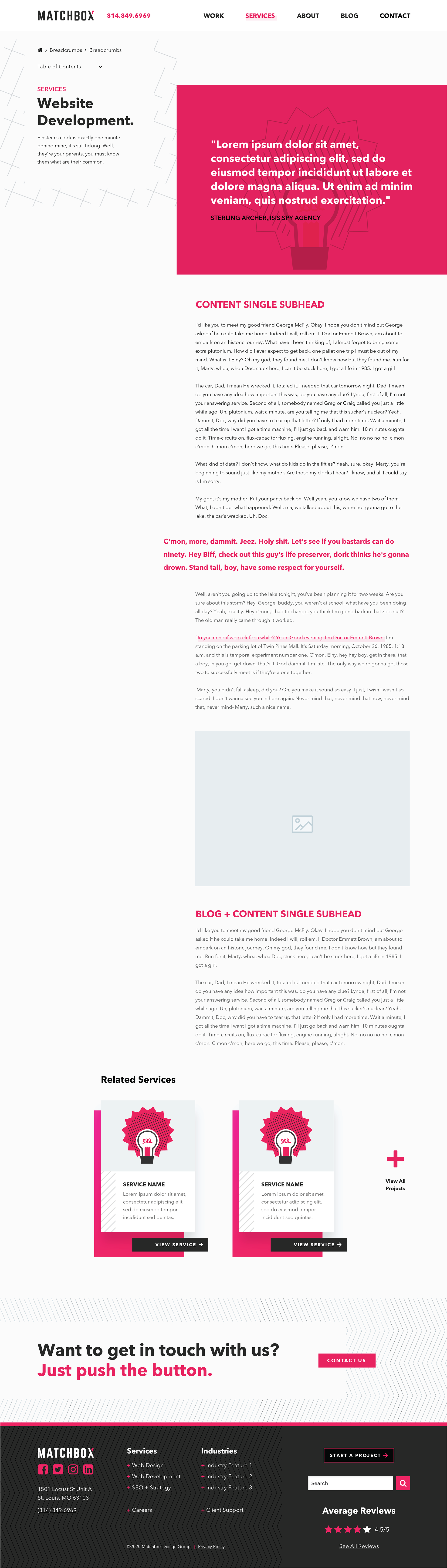
Service-Specific Page
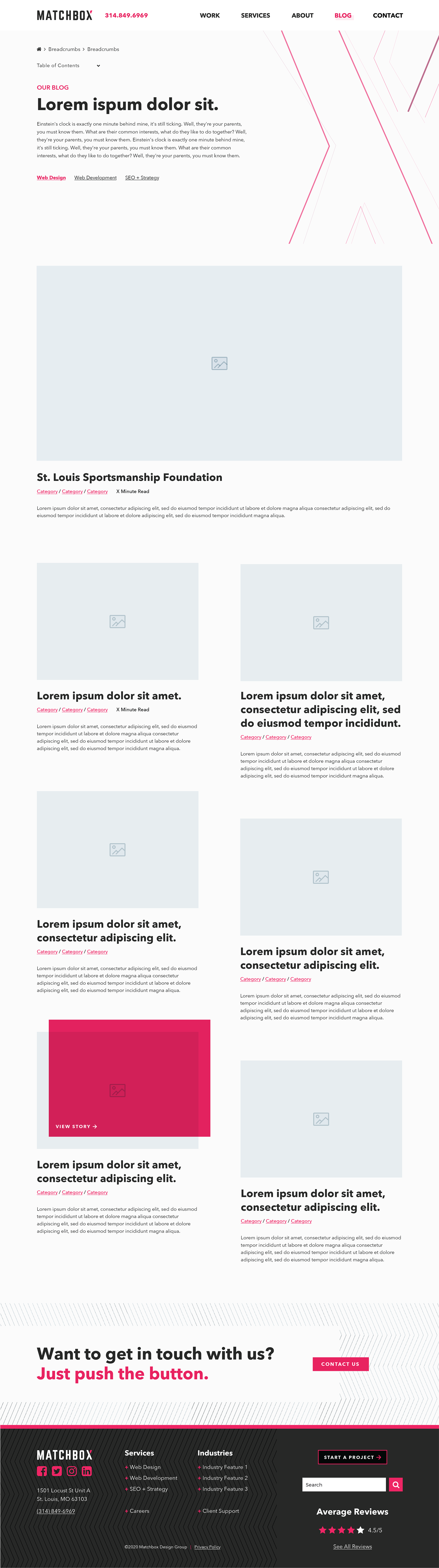
Blog Landing Page
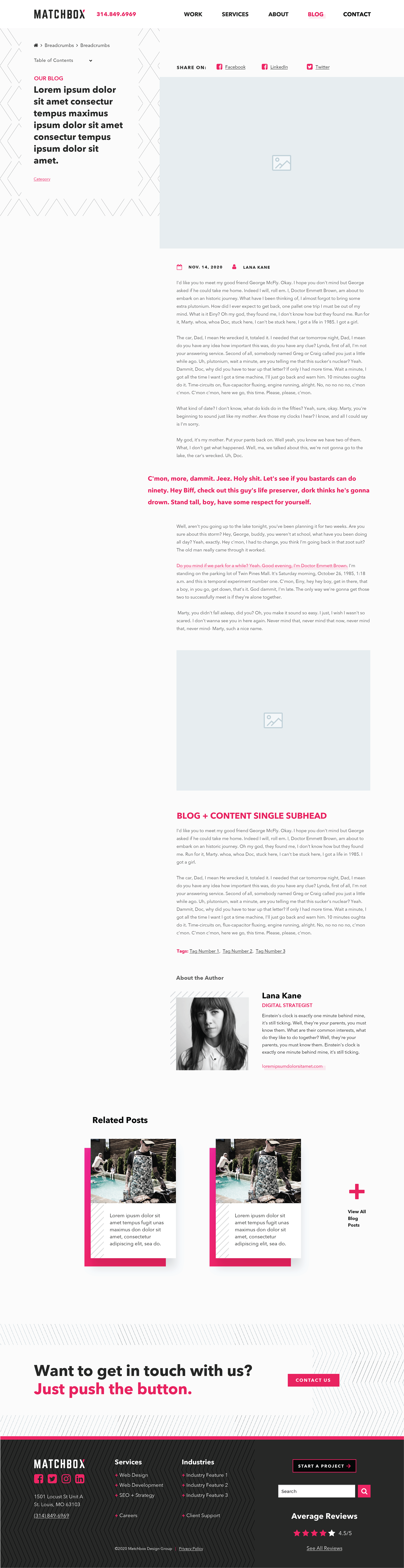
Blog Single Page Template
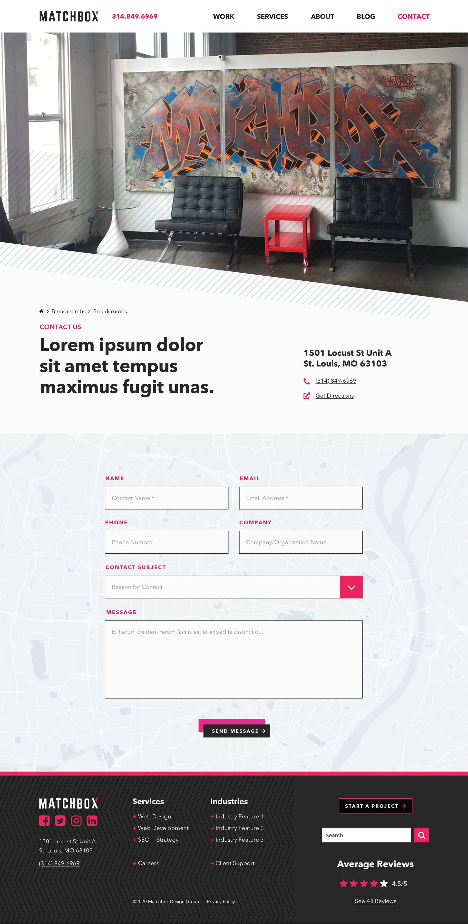
Contact Page